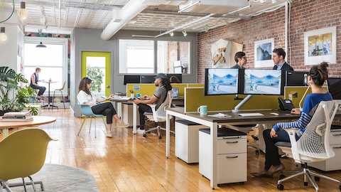
Turn Your Open Office into a Productive Office
By implying space, you can minimise distraction, encourage personalisation, create boundaries and improve wayfinding.
Download PDF (385 KB)
Recent surveys of people in open workspaces1 find that noise, distractions, and lack of privacy & personal space consistently top the list of dissatisfactions, and that people feel they are less productive as a result. In an anonymous poll of 700 “high-performance employees” across a range of industries, 54 per cent of the respondents said their office environment was “too distracting”, and 58 per cent said they needed more “private spaces for problem solving”.2
The good news is that there is a better — and more cost-effective — way to help people make sense of and find comfort in an open office. By implying space, you can transform an open-office environment into an intuitive, productive workplace without making a costly investment in inflexible, permanent walls. Here are three ways you can use implied space techniques to help minimise distractions, define space, communicate ownership of a setting and improve wayfinding — ultimately improving the experience of work.

A glass partition suggests personal privacy and minimises distractions for more productive focused work within an open office setting.
1. Minimise Distractions
Movable desktop organisers, mobile storage units and even open partitions (think of an empty picture frame) can imply refuge and personal space, but people can adjust them if they desire more connection to colleagues. Greenery and aquariums can serve a similar yet dual purpose. Strategically placed, they can block movement perceived by the periphery of vision and speed the recovery of energy depleted by interruptions or distractions.3
2. Define Space and Communicate Ownership
In a Herman Miller study of high-performing teams, researchers noted that a “variety of elements can demarcate zones: flooring materials, lighting and paths defined by furniture or other artefacts”.4 Different colour schemes can help to distinguish activity zones, as can variations in light intensity. Research findings suggest that while bright light energises and improves alertness,5 dimmer illumination can improve creative performance.6 Once you’ve defined a space, communicate ownership by allowing people to personalise it. Studies show that teams are more effective and perform at a higher level when they can signal the things they think are important about themselves by personalising their group space.7
3. Improve Wayfinding
To define pathways, vary materials on three planes: ground, vertical and overhead. At the ground and overhead levels, changes in flooring and ceiling materials can subtly imply edges that distinguish the inside from the outside of a space. On the vertical plane, variances in the height and density of boundary markers like glass partitions, sub-architectural walls and furniture can define boundaries, as can the orientation and design of access paths and entrances to different settings.

Directional carpet patterns, large planter boundaries and a glass wall work together to clearly define pathways through the open office and frame a communal production area.
Notes
1. Seth, Manav. “Working in an Open Office Is Distracting: Study.” PeopleMatters. 1 March 2018. https://www.peoplematters.in/article/life-at-work/working-in-an-open-office-is-distracting-study-17623?utm_source=peoplematters&utm_medium=interstitial&utm_campaign=learnings-of-the-day
2. Belk, William. “58% of High-Performance Employees Say They Need More Quiet Work Spaces.” Hackernoon. 12 March 2017. https://hackernoon.com/58-of-high-performance-employees-say-they-need-more-quiet-work-spaces-4381241a6453
3. Berman, Mark, et al. “The Cognitive Benefits of Interacting with Nature.” Psychological Science 2008 19:1207. http://emilkirkegaard.dk/en/wp-content/uploads/The-Cognitive-Benefits-of-Interacting-With-Nature.pdf
4. Herman Miller Insight + Exploration. “Team Landscapes 1: How to Identify and Design for Four Unique Team Types.” Confidential research report, Winter 2017.
5. Smolders, K. and Y. de Kort. “Bright Light Effects on Mental Fatigue.” Conference paper, November 2012.
6. Steidle, Anna and Lioba Werth. “Freedom from Constraints: Darkness and Dim Illusion Promote Creativity.” Journal of Environmental Psychology, 35: 67-80 (September 2013). https://www.sciencedirect.com/science/article/pii/S0272494413000261
7. Greenway, Katharine et al. “Spaces That Signal Identity Improve Workplace Productivity.” Journal of Personnel Psychology, 15: 3-43 (2016). https://www.researchgate.net/publication/301277968_Spaces_That_Signal_Identity_Improve_Workplace_Productivity


