Herman Miller’s Poster Child
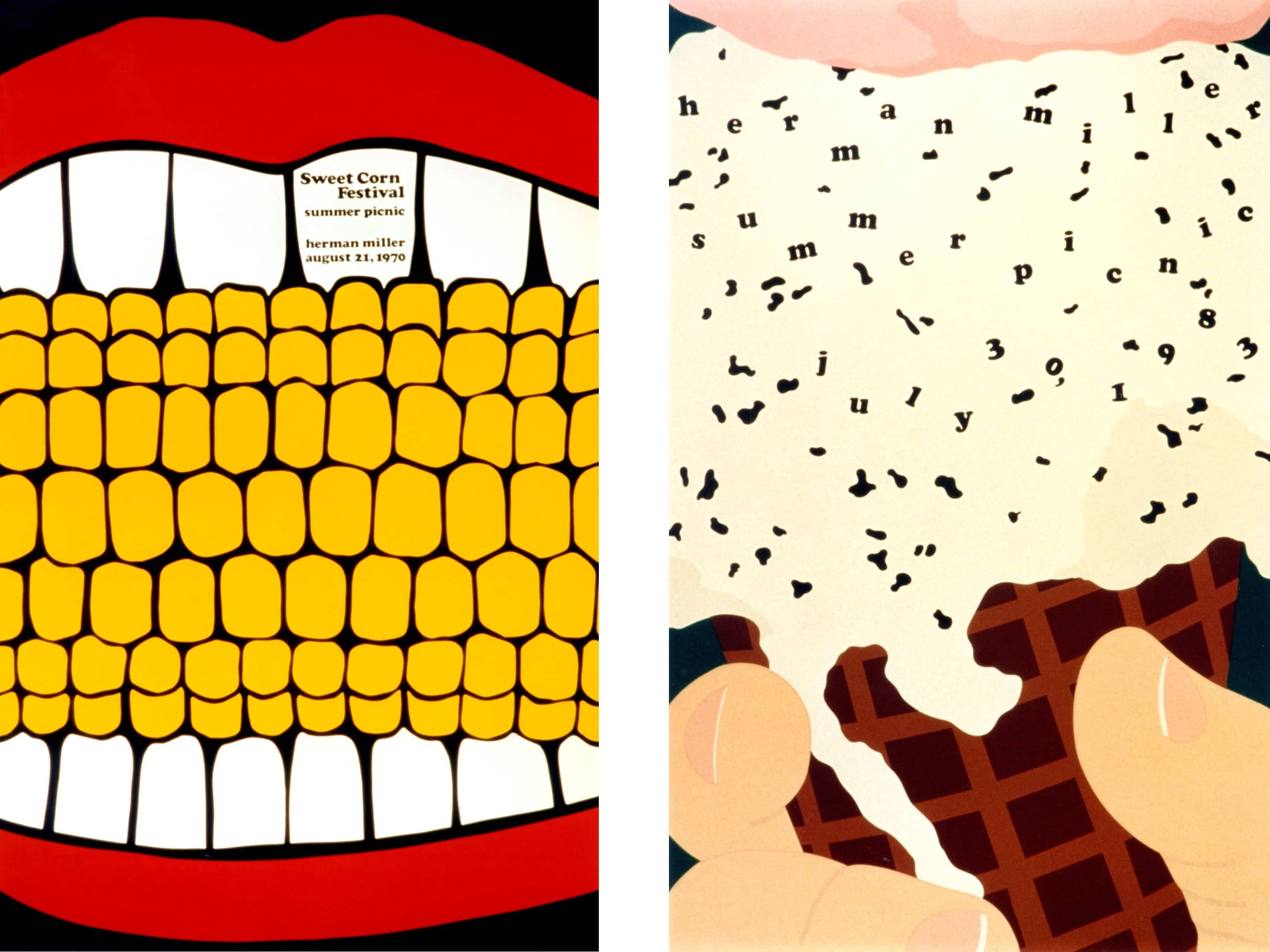
For graphic designer Steve Frykholm, life at Herman Miller really has been a picnic. The Vice President of Creative Design reflects on his 45-year tenure at the company and revisits his first – and now canonical – assignment on the job: a poster for the company picnic.
Written by: Amber Bravo
Video by: Dress Code
In 1970, Herman Miller hired its first in-house graphic designer, a bright-eyed Cranbrook graduate named Steve Frykholm. Among his initial assignments was the task of designing a poster to promote the company’s annual picnic. Little did he know that the resulting poster would spark an ambitious series that has since made its way into countless museum collections and firmly landed him on the short list of Herman Miller’s illustrious design alumni. We sat down to chat with Frykholm about the benefits of being in-house and the transformative quality of a really great poster.

Do you think it’s possible for posters to be as relevant today as they were when you started out in the ’70s?
A good poster – a poster that is really communicating an idea – is still relevant. There are so many different kinds of posters: informational posters, promotional posters, commemorative posters. To me, a poster is really nothing more than a postage stamp, except big. And I think posters should be large. They should be at least 61 x 91 cm, if not larger.
The other day, Anne Sutton [a graphic designer at Herman Miller] and I were working on a new design and I said, “Let’s go downtown to the clubs. I want you to look at the posters in the windows. We’ll go across the street, and you tell me which ones you notice and why. The better designed ones really do read from across the street.”
It’s so easy for a designer working on their monitor to just fall in love with their design and think it’s the greatest, but in reality if you take that little project and put it among the thousands of designers who are working on a similar product, it falls into that same sea of sameness. What makes a design unique, original, inventive, imaginative and compelling? What are those attributes that really make your design really stand out amongst the crowd? I think the dimensionality comes from the person designing it, if that makes any sense. The design has to have presence.

Drawing on that idea of designers falling so easily in love with the images on their screens, do you think there’s something about working analogue with tactile material that is beneficial to poster design?
I’m really disappointed I didn’t learn to work on the computer earlier in my career; it’s a great tool. At the same time, I think it can be uncomfortable for a young designer who has never really worked that much with scissors, pencils and pieces of tape – or even glue or crayons or photographs – to understand the process. I find value in making collages before I actually get a design into the computer to wrap it up and make a file so it can be printed. Analogue and digital are both important.
I’ve been working analogue all morning long on a new poster, but now that I put it in the computer, it’s going much faster. Of course, you can also go down a rabbit hole on the computer.
“To me, a poster is really nothing more than a postage stamp, except big. And I think posters should be large.”
- Steve Frykholm

Picnics from years past.
You’ve been at Herman Miller now for 45 years – that’s a long time!
It just happened. I ran into a former colleague who retired several years ago and he said, “How are things at Herman Miller?” And I said, “Well, I got to tell you, man, I wish I was 10 years younger so I could ride this sucker a little longer.”
You had mentioned in an earlier interview that you originally thought you wouldn’t stay in Michigan.
I grew up in mid-America. My formative years were spent in Kansas, then I went to college at Bradley University for my BFA, then the Cranbrook Academy of Art for an MFA in design after two years teaching in Nigeria with the Peace Corps. After that, I wanted to work on either coast – just get me out of here! New York, LA, San Francisco – that’s where it was happening.
But you stayed in Michigan.
When you get a job offer at Herman Miller, you have to at least give it a whack.

Why did you choose Cranbrook?
Cranbrook offered me a scholarship, so that’s why I went there. When I started out, I would say that at least 75% of anyone who had a reputation in the field of graphic design came out of Art Center in California. They accepted me as a second semester sophomore, and I wrote back to them and said, “I think there might be a misunderstanding; I’m applying for graduate work.” And they said, “No misunderstanding at all; you come here, you go through our curriculum, period.” I went to Cranbrook instead. Fast forward to 1992, and Art Center invites me to come and speak at their Toyota distinguished lecture series.
Nice. Did you tell that story during your talk?
I not only told the story, I read the letter!
Were you drawn to Herman Miller because of its “design DNA”?
When I first got to Cranbrook, I didn’t know about Herman Miller. But the department was made up of graphic designers, product designers, environmental designers, and they would all go over to the annual sale at Herman Miller and come back to school with these treasures – an Eames chair or some Girard fabric, and that was my first awareness of this little company out in Zeeland, Michigan. When I was in Boston interviewing, my parents told me I got a call from Herman Miller, so I called them. They were developing an internal graphic design group and wondered if I’d be interested in interviewing for a position.

Bird’s eye view of Herman Miller picnic festivities.
In terms of creativity, what do you think the benefits are of staying in-house for so long?
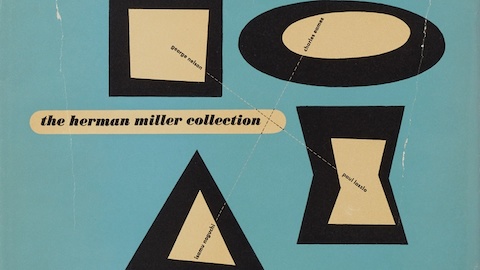
You know, I have been damn lucky. Being in an organisation that has such a wonderful design DNA and permissiveness and a drive for originality. It makes me think of this great quote by George Nelson, Herman Miller’s Design Director from the forties through the sixties. It’s from an interview he and the company’s president DJ De Pree did with design critic Ralph Caplan about the very first catalogue the Nelson Office did for Herman Miller in 1948. DJ is giving George a real rough time about how beautiful the catalogue is when nobody in this industry sells their catalogue, and George says, “I know, but there can always be a first time.” That’s been a theme at Herman Miller for 60 years now. I don’t know what 45 years in another organisation would be like; it might be hell. That’s not to say that I haven’t thought about leaving from time to time – because I have several times.
It’s sort of like being in a long relationship.
Yeah, right; you've got to work at it a lot.
Aside from the picnic posters, what are some of your other best-loved projects?
Second to the picnic posters are probably the body of annual reports. Those are incredible, if I do say so myself. Whether I’d been working with Clark Malcolm [longtime writer at Herman Miller], or whether I was working with other writers along the way, I always viewed Herman Miller’s annual report as a corporate capability piece that just happened to have numbers in it. Collectively, the body is pretty nice. Some are outstanding; others less so, but I always gave it a good crack.
Annual reports used to be quite a thing.
It used to be quite a thing, and they used to have pretty good budgets. Of course, there were good years and bad years. The good years were usually better budgets than the bad years, but we designed both with originality.
“I find value in making collages before I actually get a design into the computer to wrap it up and make a file so it can be printed. Analogue and digital are both important. ”
- Steve Frykholm

What did the bad years look like?
One year the numbers were so bad, I wanted to print the annual report on a garbage bag. I figured out we really could do it but the timeframe to get them done shot it out of the water. That was the year we put an inexpensive rain poncho on the cover as a thank you to the loyal shareholders who “weathered the storm” with us.
After all these years, are you still excited about graphic design?
Yeah, I am. I have a good time doing it. I get delighted and inspired when I see a nice piece of graphic design. But I really enjoy performance art because it has more dimensions. It’s not static. I guess that’s why I’ve gotten involved with and enjoy the Grand Rapids Ballet’s performances. My heart beats a little faster!
How did it feel to reprint that first picnic poster?
It was fun. It brought back a ton of memories on many levels, even the smell of the plant had not changed all that much. The pressman who had printed all 20 of my original posters came back to do it. It was really fun seeing the large new four colour press. I thought to myself, what could I do on this mother!
You’ll have to do something.
Maybe I will.


