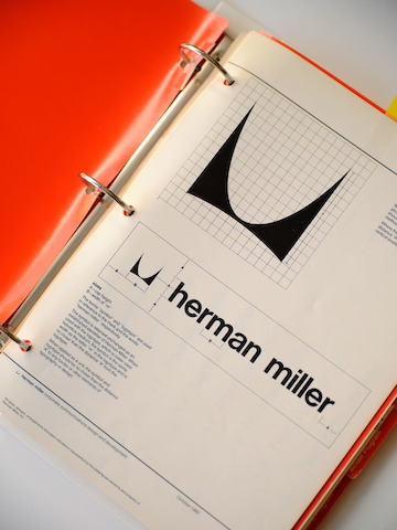
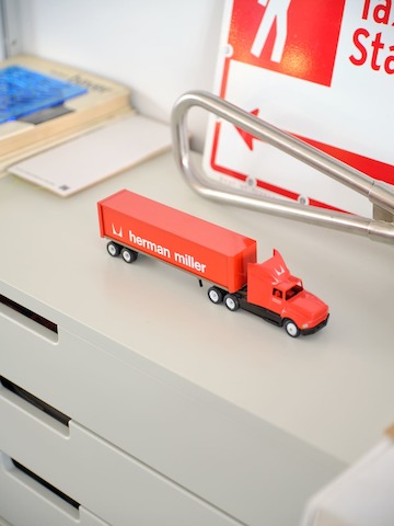
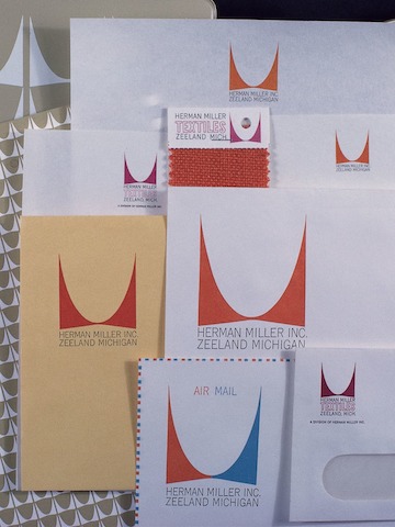
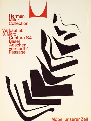
Over the course of its history, Herman Miller has been remarkably consistent in its values – problem-solving design, quality production, collaborating with exceptional people – and the way the company expresses itself to the public. Our brand expression evolves, but never subscribes to convention. Take, for example, the stylised "M" Irving Harper drew by hand in 1946: a constant throughout every era of Herman Miller graphic design.
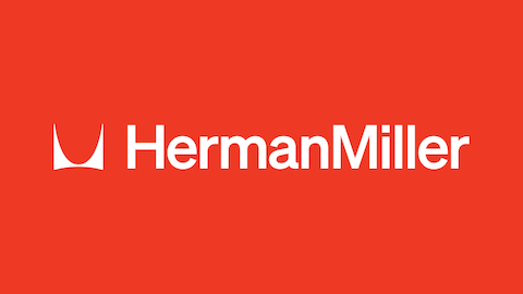
The last brand identity – employing the Meta family as its typeface, with a wordmark designed by longtime creative director Steve Frykholm – served Herman Miller well for 25 years, but that system predated many of the touchpoints we have with the customer of today. While the majority of our business happens in the contract market, Herman Miller's robust e-commerce engine and bricks-and-mortar retail stores now reach people around the world. Add this to our activation on social media platforms of every kind, and a cornerstone presence within the larger family of MillerKnoll brands. With more ways and places to interact with the Herman Miller identity, this complex ecosystem demanded an evolution of the brand’s look and feel, and with that, a complete design system: one that could flex from a mobile phone screen to a physical space and everywhere, globally, in between.
And what better time to launch than as a follow-up to our 100th brand anniversary in 2023? The idea is to jump-start the next century with a brand identity system that is timeless in its design yet carries through the boldness, rigour, joy and tactility innate to Herman Miller.
For that not-at-all daunting task, we engaged Order, a design studio located in Greenpoint, Brooklyn, and founded by designers Jesse Reed and Hamish Smyth in 2017. Order's approach is research-based, systematic and practical, with the goal of designing elegant and utilitarian brand identities with longevity. (All qualities that resonate with Herman Miller's approach to design.)
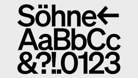
The first point of business was to address the typeface. According to Order, typography needs to operate at all sizes and in all use cases, communicate a range of tones from quiet to loud and avoid dated or trendy details. Their choice, Söhne, a font family designed by Kris Sowersby of Klim Type Foundry in New Zealand, achieves these criteria both functionally and stylistically.
As a typeface, Söhne is a humanist take on an infamous sans serif: Akzidenz-Grotesk, which was designed in Berlin around 1957 and influenced Unimark's subway signage for New York's MTA. Sowersby, who designed Söhne as an homage to Akzidenz-Grotesk, writes that the origin "was championed by the era's best designers as being 'the only [type] in spiritual accordance with our time.'"
Order zeroed in on how the scale and alignment of Irving Harper's epochal M symbol could work in better harmony with the wordmark. The symbol is now a graphic element: It's no longer locked in a container, as in its previous iteration, and can be used flexibly as pattern, identity or brand device. Likewise, the richly expanded brand colour palette retains red as its primary value while celebrating a wildly varied history of colour use.
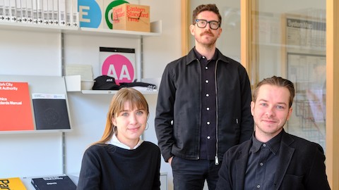
As a follow-up to Order's year long project designing Herman Miller's latest brand identity system, we visited the team – founding partner Jesse Reed, lead designer Garrett Corcoran and head of operations Megan Nardini – at their Brooklyn studio to talk shop.
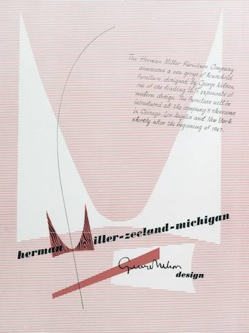
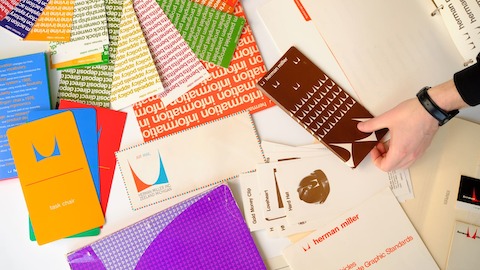
How do the graphic qualities of these archival pieces speak to Herman Miller as a larger entity?
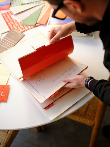
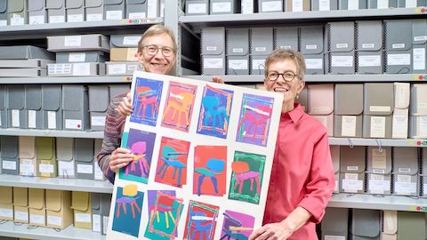
Jesse Reed: [Herman Miller is a] corporate brand, but then again, it's weird and little off in a really good way. When we were in the archives in Michigan, going through the flat files, there was just a looseness to all of it. Yet within a tight, overarching system.
Charles and Ray Eames had this idea about "taking pleasure seriously" which is relevant here – it's being able to play within a rigorous system.
Reed: You can title a brochure "information", repeat the word, set it in this serious-seeming typeface and end up with something playful.
When you were designing the new system, you set up an efficient way of communicating how tonally flexible it could be.
Garrett Corcoran: We designed reference points for what something super complex could look like, and what something super reserved could look like, and then gave your team the ability to figure out where a particular application sits within that. The goal of the system was not necessarily rigid, but a structure with inherent flexibility.
In terms of colour, you noted that with archival materials, a nearly clashing approach traces back to Alexander Girard, the founding director of Herman Miller's Textile Division, who worked closely with George Nelson and the Eames Office. You can't replicate the genius of Girard, or do exactly what he did, but you have to get in the mindset of that approach.
Corcoran: It would be doing the colour palette a disservice to just mimic [what] prior designers [have done]. We looked into why they paired certain things together and tried to figure out the thought process behind the combinations, in an effort to keep the bizarreness alive with a new palette.
Some of the early logo iterations with Harper's M feel of a different time than some of the later executions, but there is an evident connection. How have you addressed the symbol?
Reed: The obvious answer is that the M symbol is the constant, or the anchor, for every single system that has existed. Internally, you all refer to it as the "free" M, like it was on the loose. It could be a supergraphic but also one identifiable component [of an entire logomark].
Corcoran: And we wanted to get the M back to its most flexible state so that it can be the hero, it can be a signature, it can be a supporting element, and everything in between.
To geek out for a minute about the production of graphic design, what you see in these early examples are a result of how things were actually made. They feel rougher, with more hand to them, because they were literally made by hand and not on a computer.
Reed: Right – within one decade, each of these logos are slightly different. It's amazing to see, because it had to be hand-drawn every single time to be reproduced.
Corcoran: I see a different set of audience principles. What we do now is designed to be very accessible to any audience. In your case, a broad consumer base (versus used for internal communications or directed to dealers and suppliers). At the time, they weren't necessarily having to consider everything holistically, but in a good way, which gives these designs a sort of quirk.
There's an understanding of Herman Miller as "midcentury". How is that true, and how is that not the complete picture?
Corcoran: You can't ignore the legacy of Herman Miller as a company that made the iconic pieces of that era. But the driving ideas behind each of those make it bigger and more important to design in general. To me it isn't strictly midcentury because the foundation of modernism isn't an idea that is tied to a time – it lives on and evolves forever.
For the complete set of Herman Miller design guidelines, visit brandstandards.hermanmiller.com.
